Strict GUIDE Variable Importance
This notebook demonstrates the Strict GUIDE Variable Importance algorithm (Loh & Zhou, 2021).
Unlike standard impurity-based importance scores (which are biased towards high-cardinality features), Strict GUIDE scores are:
Unbiased: Derived from Chi-square tests of independence.
Normalized: A score of 1.0 represents the importance of a random noise variable.
Robust: Includes bias correction via permutation tests.
Synthetic Data Example
We will generate a dataset with:
Signal Variables:
x0(linear),x1&x2(interaction).Noise Variables:
x3(high cardinality categorical),x4(continuous).
[1]:
import matplotlib.pyplot as plt
import numpy as np
import pandas as pd

from pyguide import GuideTreeClassifier

# Reproducibility
rng = np.random.default_rng(42)
n_samples = 1000

# 1. Main signal: x0
x0 = rng.uniform(0, 1, n_samples)

# 2. Interaction signal: x1 and x2 (XOR-like)
x1 = rng.uniform(0, 1, n_samples)
x2 = rng.uniform(0, 1, n_samples)

# 3. High-cardinality noise: x3 (50 levels)
x3 = rng.choice([f"cat_{i}" for i in range(50)], n_samples)

# 4. Continuous noise: x4
x4 = rng.uniform(0, 1, n_samples)

# Target: depends on x0 and interaction(x1, x2)
# y = 1 if (x0 > 0.5) OR (x1 > 0.5 XOR x2 > 0.5)
y = ((x0 > 0.5) | ((x1 > 0.5) ^ (x2 > 0.5))).astype(int)

df = pd.DataFrame({
    'signal_main (x0)': x0,
    'signal_int_1 (x1)': x1,
    'signal_int_2 (x2)': x2,
    'noise_high_card (x3)': x3,
    'noise_cont (x4)': x4
})

print("Data generated. Calculating importance...")
Data generated. Calculating importance...
Calculate Importance Scores
We use compute_guide_importance with bias_correction=True. This runs permutation tests to establish a null distribution for every feature.
[2]:
clf = GuideTreeClassifier(interaction_depth=1, random_state=42)

# Compute strict importance
# This might take a few seconds due to permutations (default n_permutations=300)
scores = clf.compute_guide_importance(
    df, y,
    bias_correction=True,
    n_permutations=100  # Reduced for demo speed
)

# Create a DataFrame for visualization
importance_df = pd.DataFrame({
    'Feature': df.columns,
    'Strict Importance (VI)': scores
}).sort_values('Strict Importance (VI)', ascending=False)

print(importance_df)
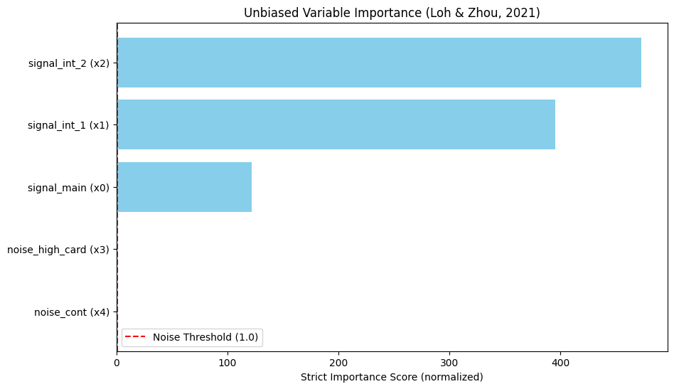
                Feature  Strict Importance (VI)
2     signal_int_2 (x2)              472.644591
1     signal_int_1 (x1)              395.120072
0      signal_main (x0)              121.875753
3  noise_high_card (x3)                0.763638
4       noise_cont (x4)                0.167837
Interpretation
Scores > 1.0: Significant association.
Scores ≈ 1.0: Noise.
Notice how noise_high_card (x3) has a score near or below 1.0, despite having many unique values. A standard Random Forest impurity importance would likely rank this noise variable very high due to cardinality bias.
[3]:
# Visualization
plt.figure(figsize=(10, 6))
plt.barh(importance_df['Feature'], importance_df['Strict Importance (VI)'], color='skyblue')
plt.axvline(x=1.0, color='red', linestyle='--', label='Noise Threshold (1.0)')
plt.xlabel('Strict Importance Score (normalized)')
plt.title('Unbiased Variable Importance (Loh & Zhou, 2021)')
plt.legend()
plt.gca().invert_yaxis()
plt.show()