import numpy as np
import pandas as pd
import statsmodels.api as sm
import statsmodels.formula.api as smf
import matplotlib.pyplot as plt
import seaborn as sns

from unifres import fresiduals, ffplot, fredplot
Environment initialized.This page provides comprehensive examples of using unifres with various model types in Python.
import numpy as np
import pandas as pd
import statsmodels.api as sm
import statsmodels.formula.api as smf
import matplotlib.pyplot as plt
import seaborn as sns
from unifres import fresiduals, ffplot, fredplotEnvironment initialized.# Generate data with a quadratic relationship
np.random.seed(1217)
n = 1000
x = np.random.normal(size=n)
z = 1 - 2*x + 3*x**2 + np.random.logistic(size=n)
y = np.where(z > 0, 1, 0)
# Fit incorrect model (missing x²)
X_wrong = sm.add_constant(x)
model_wrong = sm.GLM(y, X_wrong, family=sm.families.Binomial()).fit()
# Fit correct model
X_correct = sm.add_constant(np.column_stack([x, x**2]))
model_correct = sm.GLM(y, X_correct, family=sm.families.Binomial()).fit()
# Compare with function-function plots
fig, axes = plt.subplots(1, 2, figsize=(12, 5))
ffplot(model_wrong, ax=axes[0])
axes[0].set_title("Missing x²")
ffplot(model_correct, ax=axes[1])
axes[1].set_title("Correct Model")
plt.tight_layout()
plt.show()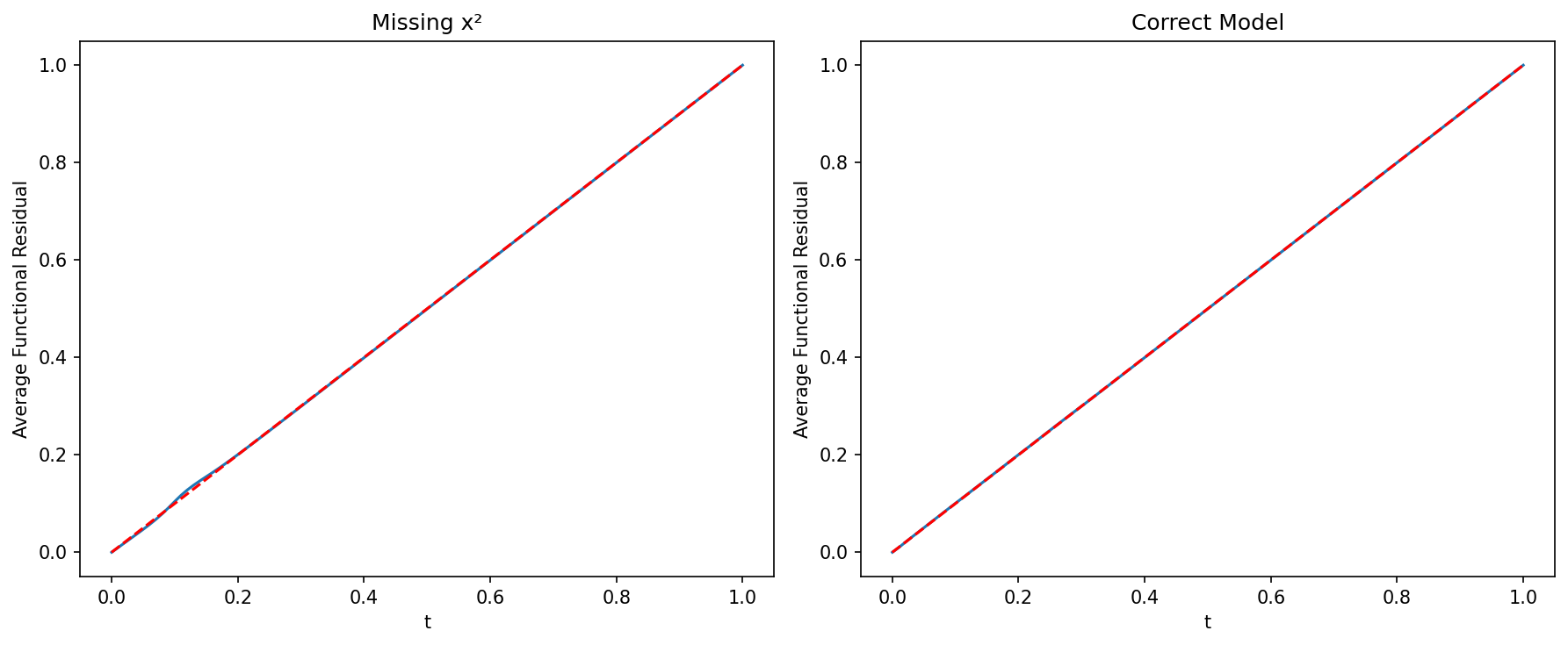
# FRED plots show where the model fails
fig, axes = plt.subplots(1, 2, figsize=(12, 5))

fredplot(model_wrong, x, type="kde", ax=axes[0])
axes[0].set_title("Wrong Model")

fredplot(model_correct, x, type="kde", ax=axes[1])
axes[1].set_title("Correct Model")

plt.tight_layout()
plt.show()
# Simulate count data
np.random.seed(42)
n = 500
x1 = np.random.normal(size=n)
x2 = np.random.normal(size=n)
lambda_ = np.exp(1 + 0.5*x1 + 0.8*x2)
y = np.random.poisson(lambda_)

# Fit model
X = sm.add_constant(np.column_stack([x1, x2]))
model = sm.GLM(y, X, family=sm.families.Poisson()).fit()

# Check model adequacy
fig, axes = plt.subplots(2, 2, figsize=(12, 10))

ffplot(model, ax=axes[0, 0])
axes[0, 0].set_title("Function-Function Plot")

fredplot(model, x1, type="kde", ax=axes[0, 1])
axes[0, 1].set_title("FRED: x1")

fredplot(model, x2, type="kde", ax=axes[1, 0])
axes[1, 0].set_title("FRED: x2")

# Surrogate residual plot
surr_res = fresiduals(model, type="surrogate")
axes[1, 1].scatter(model.fittedvalues, surr_res, alpha=0.5)
axes[1, 1].axhline(y=0.5, color='r', linestyle='--')
axes[1, 1].set_xlabel("Fitted Values")
axes[1, 1].set_ylabel("Surrogate Residuals")
axes[1, 1].set_title("Surrogate Residuals vs Fitted")

plt.tight_layout()
plt.show()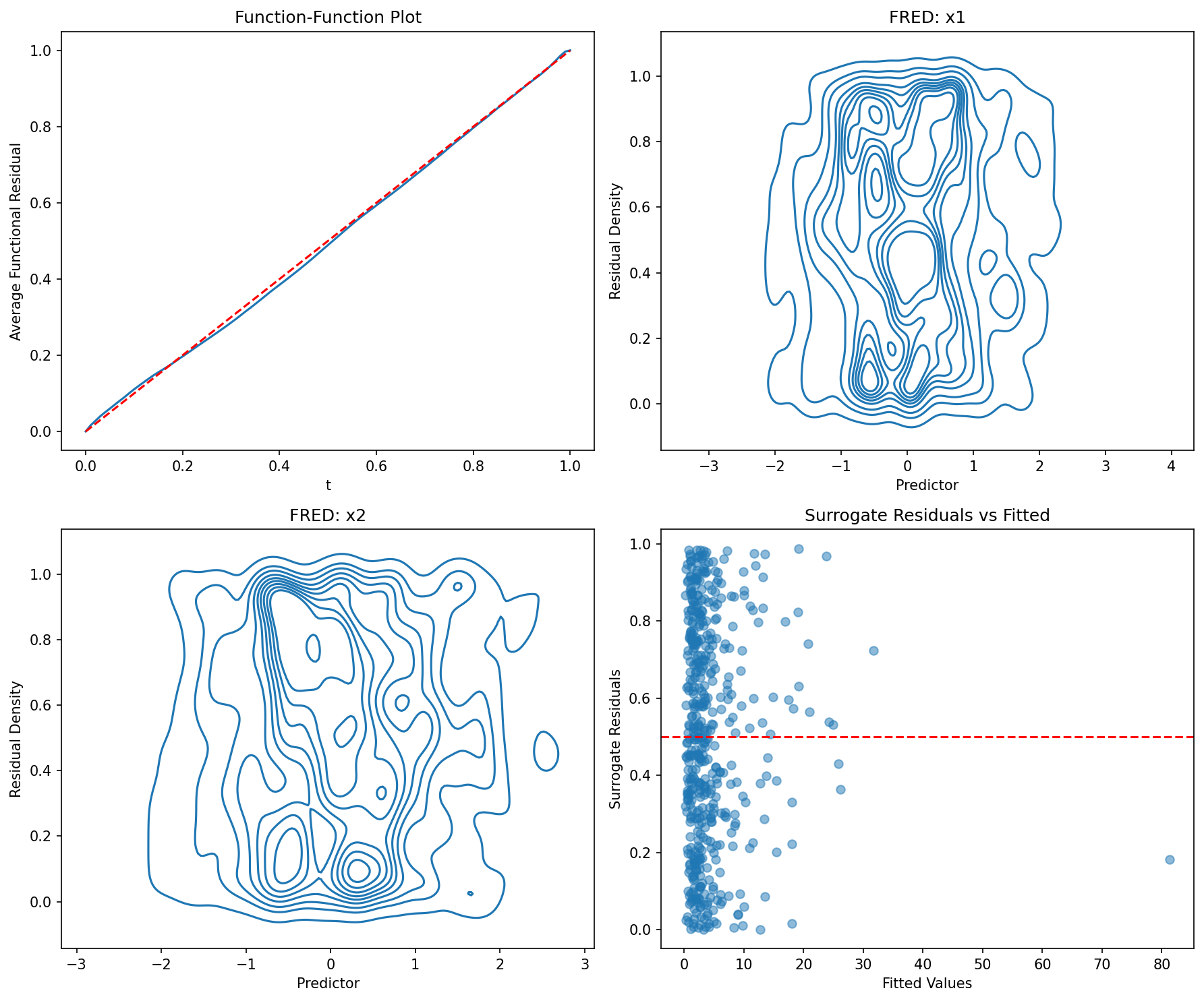
# Generate overdispersed count datanp.random.seed(123)n = 500x = np.random.normal(size=n)mu = np.exp(1 + x)# Add overdispersion via negative binomialsize = 2prob = size / (size + mu)y = np.random.negative_binomial(size, prob)# Fit Poisson (wrong)X = sm.add_constant(x)model_pois = sm.GLM(y, X, family=sm.families.Poisson()).fit()# Fit Negative Binomial (correct)model_nb = sm.NegativeBinomial(y, X).fit(disp=0)# Comparefig, axes = plt.subplots(1, 2, figsize=(12, 5))ffplot(model_pois, ax=axes[0])axes[0].set_title("Poisson")ffplot(model_nb, ax=axes[1])axes[1].set_title("Negative Binomial")plt.tight_layout()plt.show()# Generate negative binomial data
np.random.seed(2024)
n = 400
x = np.random.normal(size=n)
mu = np.exp(1 + 0.5*x)
size = 3
prob = size / (size + mu)
y = np.random.negative_binomial(size, prob)
# Fit model using discrete NegativeBinomial
X = sm.add_constant(x)
model_nb = sm.NegativeBinomial(y, X).fit(disp=0)
# Diagnostics
fig, axes = plt.subplots(1, 3, figsize=(15, 4))
ffplot(model_nb, ax=axes[0])
axes[0].set_title("Fn-Fn Plot")
fredplot(model_nb, x, type="kde", ax=axes[1])
axes[1].set_title("FRED Plot")
# Compare surrogate to traditional residuals
surr_res = fresiduals(model_nb, type="surrogate")
pearson_res = model_nb.resid_pearson
axes[2].scatter(surr_res, pearson_res, alpha=0.5)
axes[2].set_xlabel("Surrogate Residuals")
axes[2].set_ylabel("Pearson Residuals")
axes[2].set_title("Residual Comparison")
plt.tight_layout()
plt.show()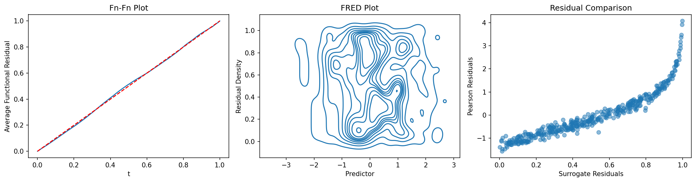
# Create a DataFrame
np.random.seed(555)
n = 500
df = pd.DataFrame({
    'x1': np.random.normal(size=n),
    'x2': np.random.uniform(-1, 1, size=n),
    'group': np.random.choice(['A', 'B', 'C'], size=n)
})

# Generate outcome
eta = 1 + 0.5*df['x1'] - 0.3*df['x2']
df['y'] = np.random.poisson(np.exp(eta))

# Fit model using formula
model = smf.glm('y ~ x1 + x2', data=df, family=sm.families.Poisson()).fit()

# Diagnostics with DataFrame columns
fig, axes = plt.subplots(2, 2, figsize=(12, 10))

ffplot(model, ax=axes[0, 0])
axes[0, 0].set_title("Fn-Fn Plot")

fredplot(model, df['x1'].values, ax=axes[0, 1])
axes[0, 1].set_xlabel("x1")
axes[0, 1].set_title("FRED: x1")

fredplot(model, df['x2'].values, ax=axes[1, 0])
axes[1, 0].set_xlabel("x2")
axes[1, 0].set_title("FRED: x2")

# Residuals by group
surr_res = fresiduals(model, type="surrogate")
for group in ['A', 'B', 'C']:
    mask = df['group'] == group
    axes[1, 1].scatter(df.loc[mask, 'x1'], surr_res[mask],
                      label=group, alpha=0.5)
axes[1, 1].axhline(y=0.5, color='gray', linestyle='--')
axes[1, 1].set_xlabel("x1")
axes[1, 1].set_ylabel("Surrogate Residuals")
axes[1, 1].set_title("Residuals by Group")
axes[1, 1].legend()

plt.tight_layout()
plt.show()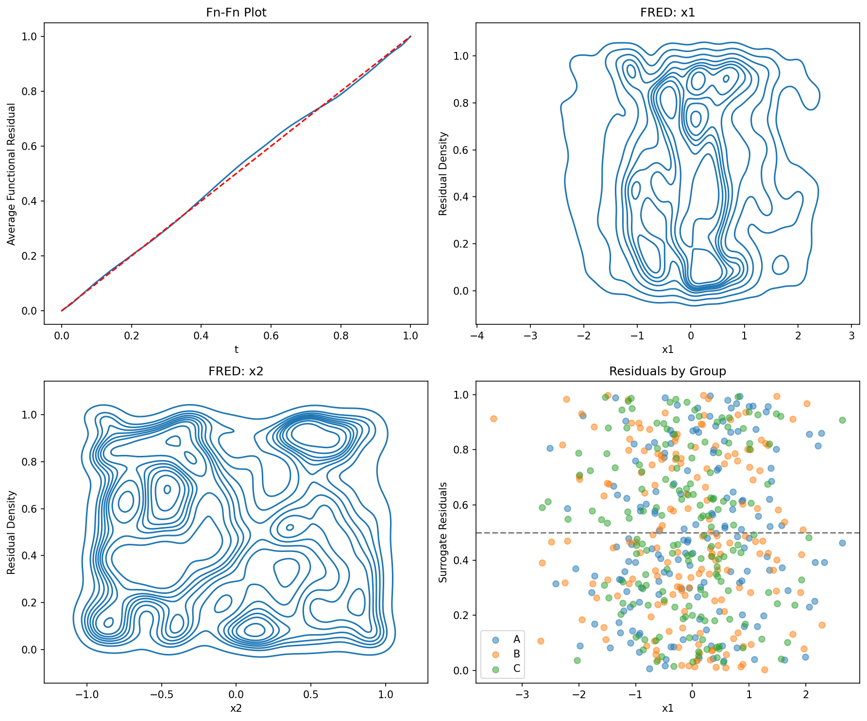
# Generate data
np.random.seed(333)
n = 800
x1 = np.random.normal(size=n)
x2 = np.random.normal(size=n)
x3 = np.random.normal(size=n)

# True model includes x1 and x2, but not x3
eta = 1 + x1 + 0.5*x2
y = np.random.binomial(1, 1/(1 + np.exp(-eta)))

# Fit models
X1 = sm.add_constant(x1)
X2 = sm.add_constant(np.column_stack([x1, x2]))
X3 = sm.add_constant(np.column_stack([x1, x2, x3]))

model1 = sm.GLM(y, X1, family=sm.families.Binomial()).fit()
model2 = sm.GLM(y, X2, family=sm.families.Binomial()).fit()
model3 = sm.GLM(y, X3, family=sm.families.Binomial()).fit()

# Visual comparison
fig, axes = plt.subplots(2, 3, figsize=(15, 10))

ffplot(model1, ax=axes[0, 0])
axes[0, 0].set_title("Model 1: x1 only")

ffplot(model2, ax=axes[0, 1])
axes[0, 1].set_title("Model 2: x1 + x2")

ffplot(model3, ax=axes[0, 2])
axes[0, 2].set_title("Model 3: x1 + x2 + x3")

fredplot(model1, x1, type="kde", ax=axes[1, 0])
axes[1, 0].set_title("M1 FRED")

fredplot(model2, x1, type="kde", ax=axes[1, 1])
axes[1, 1].set_title("M2 FRED")

fredplot(model3, x1, type="kde", ax=axes[1, 2])
axes[1, 2].set_title("M3 FRED")

plt.tight_layout()
plt.show()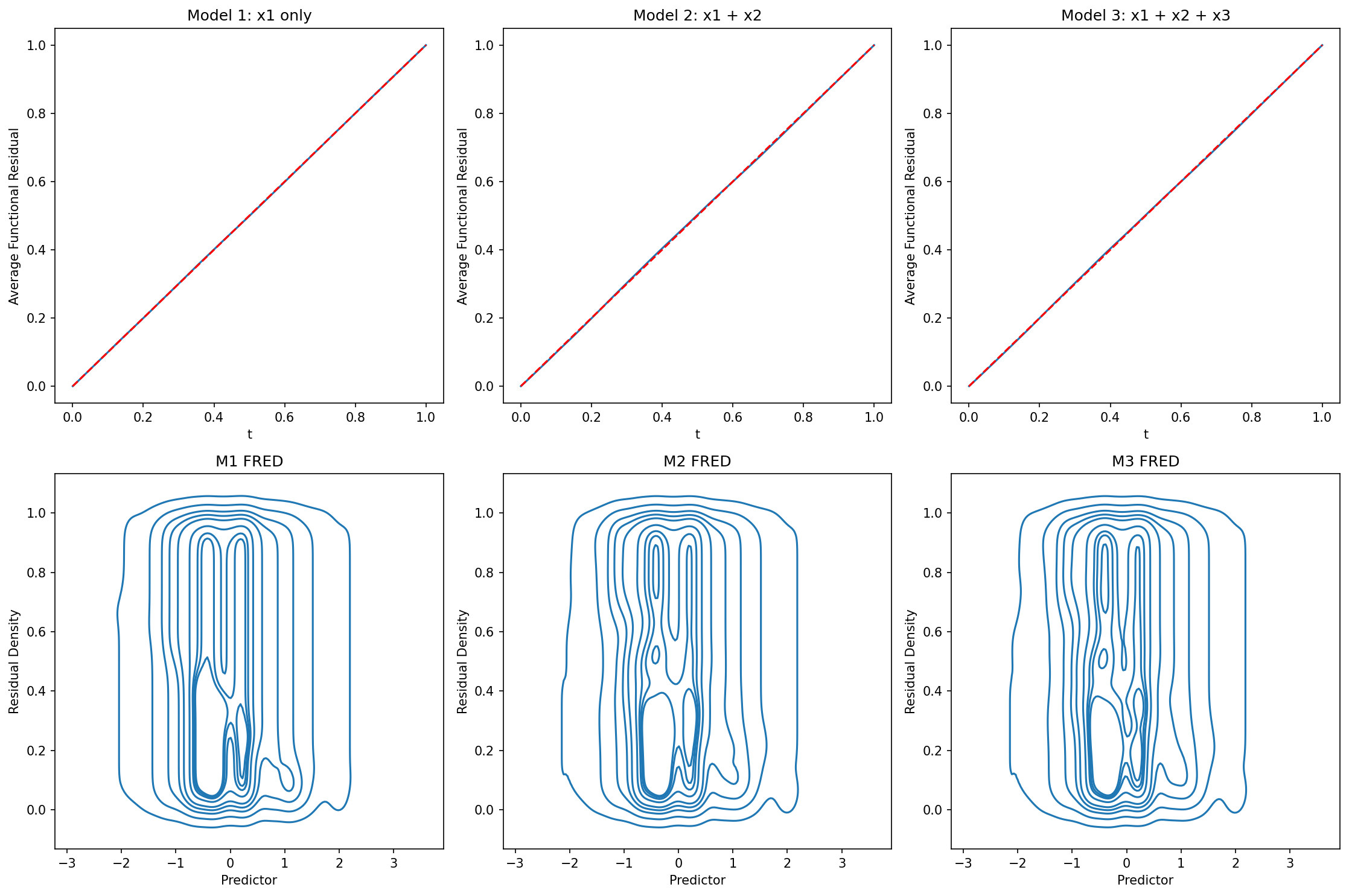
# Fit a model
np.random.seed(100)
n = 500
x = np.random.normal(size=n)
y = np.random.binomial(1, 1/(1 + np.exp(-x)))
X = sm.add_constant(x)
model = sm.GLM(y, X, family=sm.families.Binomial()).fit()
# Customize ffplot
fig, ax = plt.subplots(figsize=(8, 6))
ffplot(model, ax=ax, color='steelblue', linewidth=2)
ax.set_xlabel("Theoretical", fontsize=12, fontweight='bold')
ax.set_ylabel("Observed", fontsize=12, fontweight='bold')
ax.set_title("Custom Function-Function Plot",
fontsize=14, fontweight='bold')
ax.grid(True, alpha=0.3)
plt.tight_layout()
plt.show()
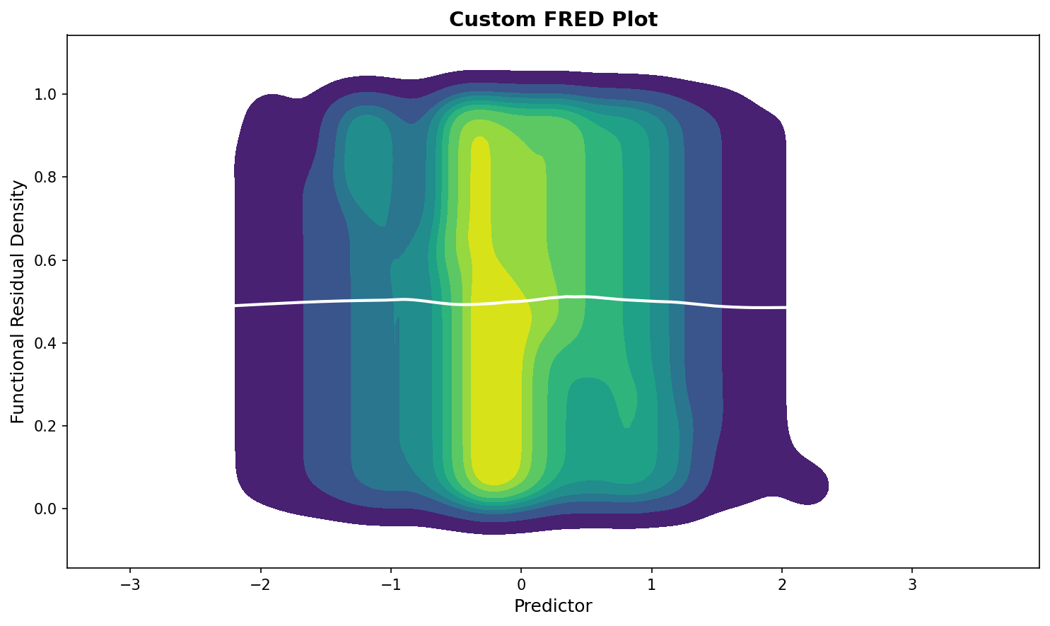
# Customize fredplot
fig, ax = plt.subplots(figsize=(10, 6))
fredplot(model, x, type="kde", ax=ax,
lowess=True, frac=0.5,
fill=True, cmap='viridis')
ax.set_xlabel("Predictor", fontsize=12)
ax.set_ylabel("Functional Residual Density", fontsize=12)
ax.set_title("Custom FRED Plot", fontsize=14, fontweight='bold')
plt.tight_layout()
plt.show()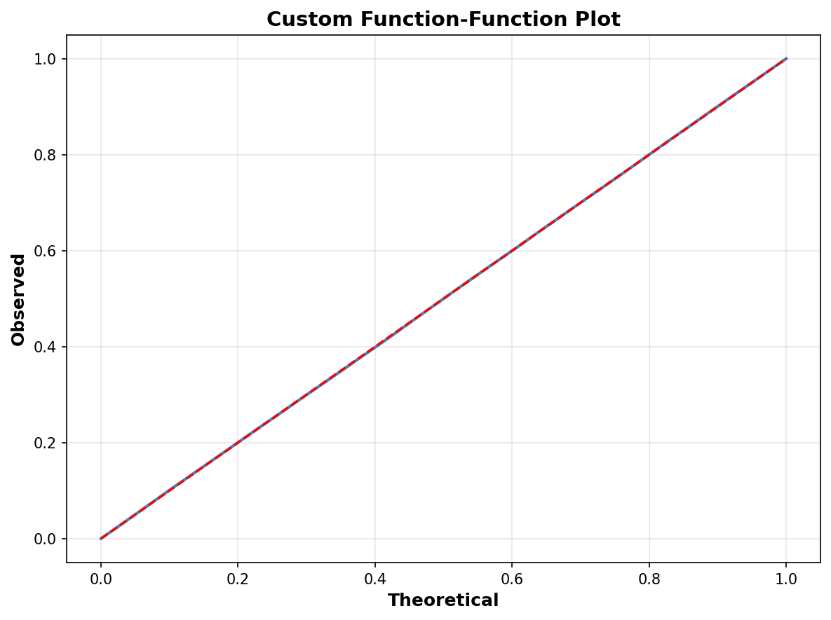
import seaborn as sns

# Set seaborn style
sns.set_style("whitegrid")
sns.set_palette("husl")

# Create plots with seaborn styling
fig, axes = plt.subplots(1, 2, figsize=(14, 5))

ffplot(model, ax=axes[0])
axes[0].set_title("Seaborn Styled Fn-Fn Plot", fontsize=12)

fredplot(model, x, type="kde", ax=axes[1], lowess=True)
axes[1].set_title("Seaborn Styled FRED Plot", fontsize=12)

plt.tight_layout()
plt.show()

# Reset to default
sns.reset_defaults()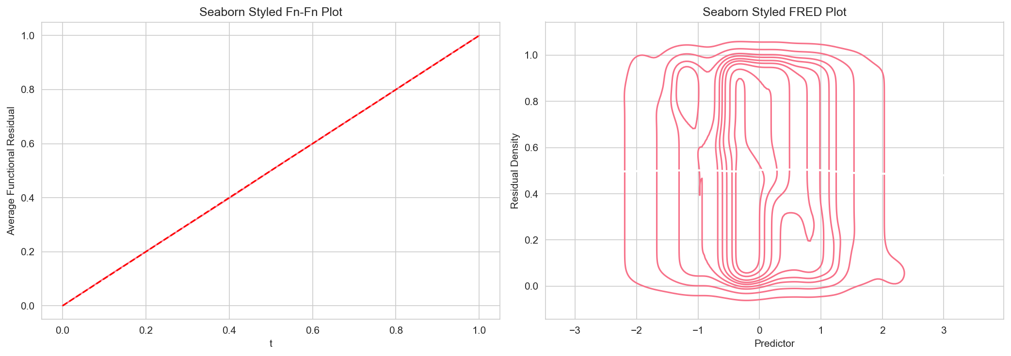
# Large dataset
np.random.seed(12345)
n = 50000
x_large = np.random.normal(size=n)
y_large = np.random.binomial(1, 1/(1 + np.exp(-x_large)))
X_large = sm.add_constant(x_large)
model_large = sm.GLM(y_large, X_large, family=sm.families.Binomial()).fit()
# Use subsampling for faster plotting
ffplot(model_large, n=1000)
plt.title("Subsampled Fn-Fn Plot (n=1000)")
plt.show()
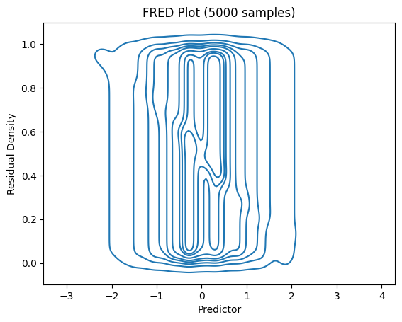
# For FRED plots, use subsampling
fredplot(model_large, x_large, type="kde", n=5000)
plt.title("FRED Plot (5000 samples)")
plt.show()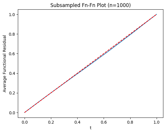
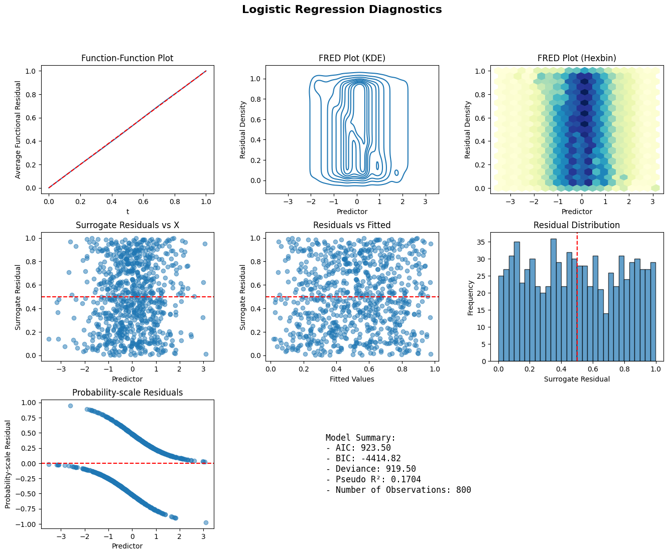
def diagnostic_panel(model, x, title="Model Diagnostics"):
    fig = plt.figure(figsize=(16, 12))
    gs = fig.add_gridspec(3, 3, hspace=0.3, wspace=0.3)

    ax1 = fig.add_subplot(gs[0, 0])
    ffplot(model, ax=ax1)
    ax1.set_title("Function-Function Plot")

    ax2 = fig.add_subplot(gs[0, 1])
    fredplot(model, x, type="kde", ax=ax2)
    ax2.set_title("FRED Plot (KDE)")

    ax3 = fig.add_subplot(gs[0, 2])
    fredplot(model, x, type="hex", ax=ax3)
    ax3.set_title("FRED Plot (Hexbin)")

    ax4 = fig.add_subplot(gs[1, 0])
    surr_res = fresiduals(model, type="surrogate")
    ax4.scatter(x, surr_res, alpha=0.5)
    ax4.axhline(y=0.5, color='r', linestyle='--')
    ax4.set_xlabel("Predictor")
    ax4.set_ylabel("Surrogate Residual")
    ax4.set_title("Surrogate Residuals vs X")

    ax5 = fig.add_subplot(gs[1, 1])
    ax5.scatter(model.fittedvalues, surr_res, alpha=0.5)
    ax5.axhline(y=0.5, color='r', linestyle='--')
    ax5.set_xlabel("Fitted Values")
    ax5.set_ylabel("Surrogate Residual")
    ax5.set_title("Residuals vs Fitted")

    ax6 = fig.add_subplot(gs[1, 2])
    ax6.hist(surr_res, bins=30, edgecolor='black', alpha=0.7)
    ax6.axvline(x=0.5, color='r', linestyle='--')
    ax6.set_xlabel("Surrogate Residual")
    ax6.set_ylabel("Frequency")
    ax6.set_title("Residual Distribution")

    ax7 = fig.add_subplot(gs[2, 0])
    prob_res = fresiduals(model, type="probscale")
    ax7.scatter(x, prob_res, alpha=0.5)
    ax7.axhline(y=0, color='r', linestyle='--')
    ax7.set_xlabel("Predictor")
    ax7.set_ylabel("Probability-scale Residual")
    ax7.set_title("Probability-scale Residuals")

    ax8 = fig.add_subplot(gs[2, 1:])
    ax8.axis('off')
    summary_text = f"""
    Model Summary:
    - AIC: {model.aic:.2f}
    - BIC: {model.bic:.2f}
    - Deviance: {model.deviance:.2f}
    - Pseudo R²: {1 - model.deviance/model.null_deviance:.4f}
    - Number of Observations: {model.nobs:.0f}
    """
    ax8.text(0.1, 0.5, summary_text, fontsize=12,
             verticalalignment='center', family='monospace')

    fig.suptitle(title, fontsize=16, fontweight='bold')
    plt.show()

np.random.seed(999)
n = 800
x_diag = np.random.normal(size=n)
y_diag = np.random.binomial(1, 1/(1 + np.exp(-x_diag)))
X_diag = sm.add_constant(x_diag)
model_diag = sm.GLM(y_diag, X_diag, family=sm.families.Binomial()).fit()
diagnostic_panel(model_diag, x_diag, title="Logistic Regression Diagnostics")